Discover Geeks Academy’s articles on: Blockchain, Coding, Cybersecurity, Cloud, Big Data, Artificial Intelligence, Gaming, Digital Innovation
Today, in the world of new digital professions, Big Data is here to stay. There are multiple professional profiles: those who clean data (data cleaning), those who try to get insights (data exploration) and those who finally give a spark of light to numbers, columns and rows, through data visualization. Data visualization is chronologically the last stage of data analysis yet the most significant and useful, especially for those who are not data experts. Let's think of bar and line charts: we have certainly seen them dozens of times while watching the news or reading a newspaper. What attracts the users’ attention? The cleanliness and intuitiveness of those charts. Sometimes numbers are not enough as the eye wants its share.

What is data visualization?
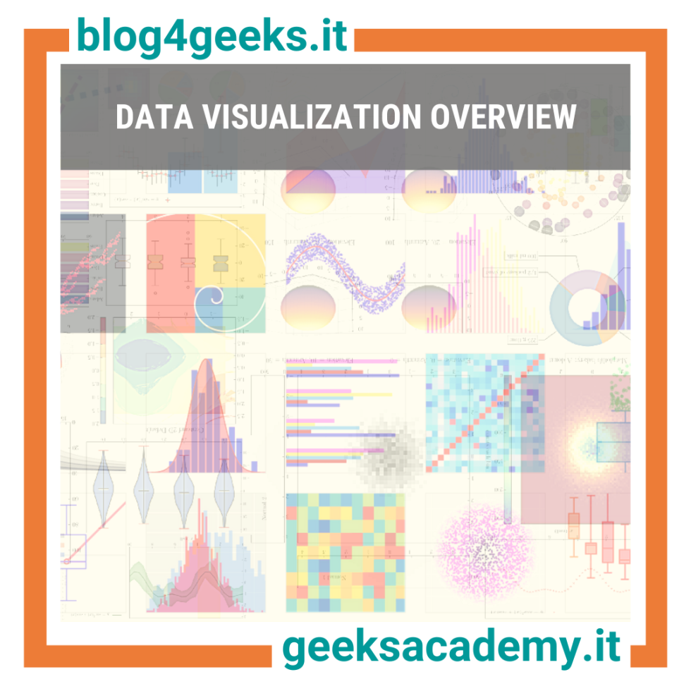
In an increasingly data-driven world, we need to manage and understand a huge amount of data that was unthinkable just a couple of years ago. Despite the enormous efforts of listing, partitioning and segmenting, sometimes numbers alone are not enough to make potentially impactful decisions for your company. That’s why data visualization comes into play. Data visualization is the graphical representation of information and data. Graphical representation of data was initially devised to unburden a large amount of information through graphs. It is more attractive for an average user to see a bar chart than a digits sequence. Therefore, the rise of big data and data visualization have helped analysts to understand information and gain insights that are difficult to perceive without the use of specific graphics.
Data visualization tools
Nowadays there are multiple solutions that allow users to create detailed and complex graphics with just a few clicks. For those who use Excel and feel the need to stay within the Office family services and apps, Microsoft has a solution. PowerBI is a tool firmly connected to Excel, allowing users to turn worksheets into graphical representations. It is one of the most popular Business Intelligence tools. However in recent years, due to Office paid license, we have had a new undisputed leader for data visualization, Tableau. Tableau is a free software and, unlike PowerBI, is available for both Windows and Apple devices. In fact, its freeware nature is the reason for its mass adoption. Last but not least, there is Python and its libraries. Python is the most popular programming language in data science and machine learning at the moment. By writing a few lines of code, libraries such as Seaborn and Matplotlib, allow users to give life to precious data.

Between science and art
Through the power of data visualization tools, a movement between science and art has risen. Internet talks about Data Art and, although conservatives do not recommend the use of highly convoluted charts, we have recently seen the creation of infographics that could be exhibited in a contemporary art museum. Works such as those made by Nadieh Bremer leave you speechless and it is frequently happening to discover very complex infographics within newspapers or TV shows.
The future is Big Data
During the past years, the total amount of data created has soared, mostly due to the expansion of the Internet of Things (IoT). The data market is therefore growing dramatically and, according to the latest estimates, is going to reach a value of $103 billion by 2027. Here are some figures about the world of data:
- Businesses generate approximately 2,000,000,000,000,000,000 bytes of data per day.
- 97.2% of companies invest in AI and Big Data.
While the numbers speak for themselves, companies struggle to keep up with the ceaseless creation of new data:
- About 95% of companies report an inability to understand and manage unstructured data.
- Only about 26% of companies say they have achieved a data-driven culture.
Don't live the future as a sidekick... be a superhero! Discover Geeks Academy’s training offer in AI & Big Data:
Sources:
https://www.tableau.com/learn/articles/data-visualization
https://www.visualcinnamon.com/portfolio/
https://matplotlib.org/
https://www.storybench.org/nadieh-bremer-on-thinking-outside-the-lines/